What makes users fall in love with a mobile app? Every tap, swipe, or hesitation inside your app is telling you something. It's how app naturally everything flows. Users either feel in control or they leave.
Studies show that 88% of users are less likely to return to an app after a bad user experience.But intuitive user experience doesn’t happen by accident. It’s the result of a clear, structured UI/UX design process for mobile apps.
And yet, many startups jump into app design too early, before fully understanding their users or validating their product idea.
But before the design process even begins, something else needs to be in place: a well-developed product foundation. If you haven’t nailed the problem, the user, and the value proposition, even the most beautiful user interface can’t save your product.
That’s why the UI/UX design process should never come first, and we always recommend starting with a
detailed Discovery Phase. We’ve broken it down for you step-by-step in this guide: from market fit validation to idea prioritization and MVP scoping.
Once your idea is validated and priorities are clear, UI/UX design becomes your superpower. In our previous article on
why UI/UX matters for startups, we explained how good design drives growth, builds trust, and prevents costly mistakes. We also analyzed real examples of apps that got it right (and wrong). This time, we’re diving deeper.
This article walks you through the full UI/UX mobile app design process, from goal setting and user research all the way to wireframes, prototyping, visual design, testing, usability developer handoff, and mobile-specific considerations.
Whether you're a founder, product owner, or part of a dev agency, this is your step-by-step guide to designing an app from scratch that users actually want to use.
Let’s get started.
Define What Matters Before You Design Mobile App
Every great mobile application begins with a goal. A clear, measurable outcome that everyone on the team rallies around. That’s why every successful ui/ux design process for mobile apps begins with alignment: What are we solving? For whom? And what does success look like for the business?
Your app is part of a business strategy, and design of a mobile application needs to be treated the same way.
If you’ve already
completed a discovery phase, you likely have user insights, market context, and a defined MVP scope. That gives you a strong foundation. But if that research hasn’t been done yet, now’s the time. Because clear design goals shaped by real user needs, friction points, and market realities.
Look at the insights you have. Fill in any gaps through targeted research. Then use that knowledge to define product goals that are specific, aligned with the business.
The research defines the goal. The goal drives the design.
Competitor & Market Analysis for Mobile Apps
You're not the only one playing on this field, so it's important to keep an eye on the other players as well.
Analyze competing mobile apps: What’s working? Where are users frustrated? Map out their onboarding, navigation, and core features. Read user reviews, that’s free, raw UX feedback at scale. You’ll spot gaps, missed opportunities, and UX design mistakes to avoid.
Study the market:
- Who are your users psychographically?
- What trends are shaping their expectations: dark mode, AI, privacy controls?
- What platforms do they use?
- And what regulations might affect your UI/UX design process, especially if you’re working in healthcare, finance, or education?
This competitive and market research informs better product design for startups, guides strategic feature prioritization, and lays the groundwork for effective mobile app usability testing later in the design process.
And we move on to the next step, conducting user research.
Conduct user research
You’ve defined your product idea. You’ve done with competitor and market research. Now comes the most important test: Do users care?
User research is a continuation of the product discovery process. It helps you grounds your product in reality, instead of assumptions. It’s the foundation for designing a user experience that solves real problems and creates value.
Interviews, Surveys, Field studies
Interviews uncover the reasons behind user behavior. Talk to potential users one-on-one. Let them describe their habits, frustrations, and hacks around the problem your mobile app aims to solve. Even 5-7 interviews can reveal recurring pain points and motivations. Use open-ended questions. Don’t pitch, listen.
Surveys scale that feedback. Once you’ve spotted themes in interviews, run a short survey to validate those insights across a broader audience. Keep it under 10–12 questions, use plain language, and mix ratings with open comments.
Field studies take you deeper. Watch users complete tasks in their real environments: shopping, commuting, budgeting, or anything your app relates to. You’ll see context, workarounds, and friction points they may not even articulate in interviews.
User research for startups it’s about finding patterns that help you design a product. These insights will directly inform your user personas, user journeys, and core UX decisions and help you to set meaningful design goals.
How to Set Design Goals Aligned with Business Objectives
Once you’ve gathered insight from the market and real users, it’s time to turn that information into direction. This is where goals come in.
Here’s how to set design goals properly, without overcomplicating it.
Start with the business context.
- What’s the product supposed to do for the company? Is it meant to increase activation, reduce churn, expand into a new market? You can’t prioritize everything, so define 1–3 clear goals tied to stakeholder-aligned or trackable metrics.
Involve stakeholders.
- From the very beginning, include product managers, designers, developers, marketers. Early alignment prevents wasted cycles later.
Map user needs to business goals.
- Discovery should’ve revealed user problems, friction points, and unmet needs, and now you’re working with that information. The goal is to connect those insights to your UX design decisions.
Set SMART UX goals.
- Even if you’re still pre-launch. You don’t need exact metrics from your own app yet. Instead, use industry benchmarks or discovery-phase insights to create realistic projections. For example:
- “Achieve a 70% completion rate for onboarding within the first month of launch”
- “Enable users to complete the core action (e.g., creating an event) within 2 taps from the home screen.”
You need to clarify right direction, set smart, business-aligned UX goals before diving into the app design. Want more users to complete onboarding? Reduce steps, show value faster, add helpful nudges. Want higher retention? Guide users toward repeatable actions and reinforce small wins.
Create User Personas & Customer Journey Maps
Once your researches is done, it’s time to turn findings into practical design insights. That’s where user personas and customer journey maps come in. It's a powerful tool for creating intuitive, user-centered mobile apps that align with your product strategy.
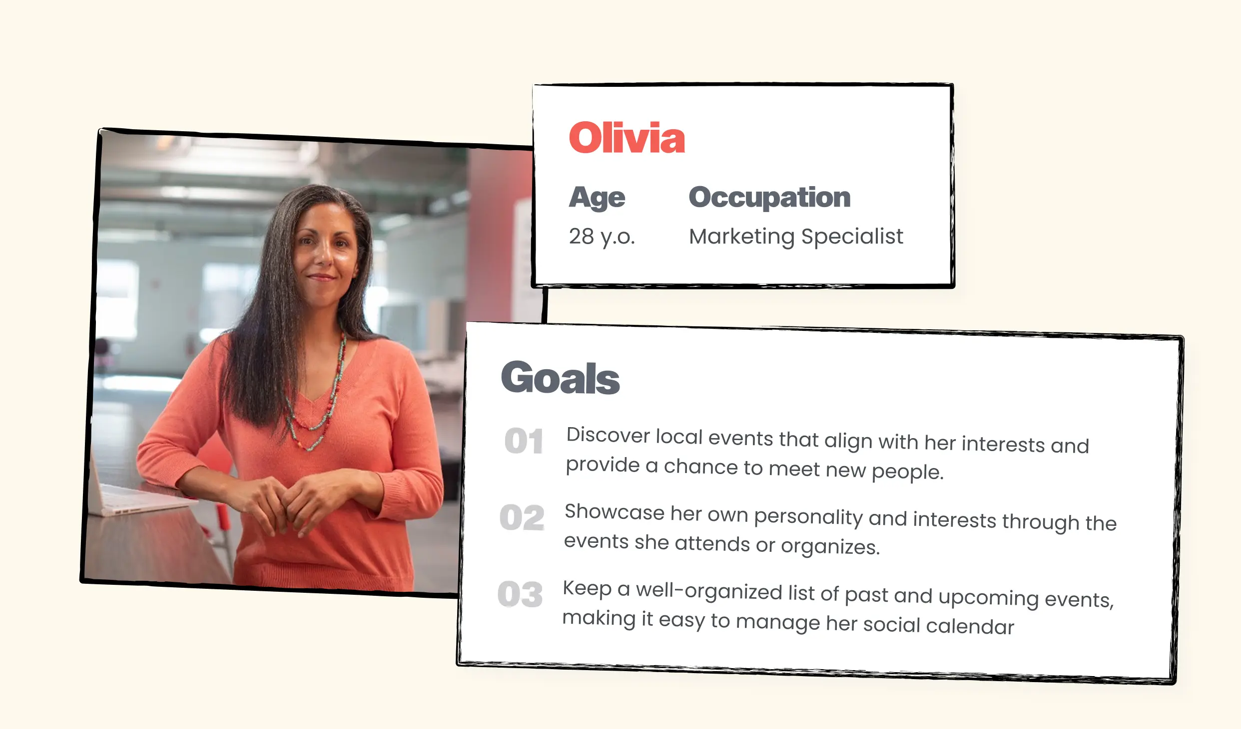
How to Create User Personas for Mobile App
User personas are fictional, research-backed profiles that represent key user types of your app. They help align your team around the needs, behaviors, frustrations, and goals of real users.
Why does it matter? Personas give shape to your target audience, so your product doesn’t try to solve too many problems at once.
Steps to build strong personas:
- Cluster your research. Group users based on discovery phase, behavioral patterns from interviews, surveys, and usability testing. Think beyond demographics, focus on goals, habits, and pain points.
- Document key traits. Include name, photo, age, job, goals, frustrations, and preferred mobile devices or apps. Add a direct quote and brief story to bring them to life.
- Keep it actionable. Ask: How would this person use your app? Where would they struggle? What features matter most?
- Limit to 3–5 personas. Focus on your core user segments. Too many personas can dilute your app design process.
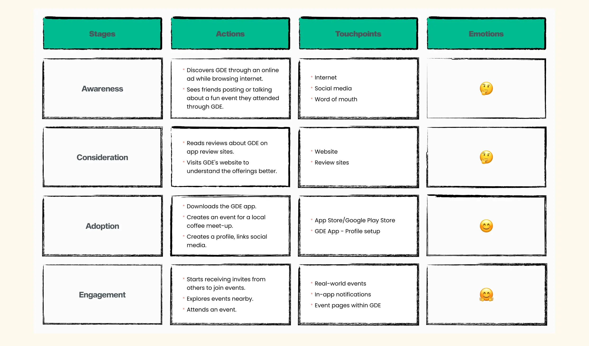
Customer Journey Mapping for Better Mobile UX
Once personas are defined, it’s time to walk in their shoes. A customer journey map visualizes how a person interacts with your mobile app (or process your app supports), from discovery to goal completion.
It helps you understand the full user experience: the touchpoints, the emotions, and the friction. The goal here is to design a seamless experience that supports their needs at every step of the user journey.
Steps to create a customer journey map:
- Select a persona and a goal. E.g., “Alex, 27, wants to book a gym session during lunch.”
- Break down the stages. Awareness → Discovery → Action → Outcome → Reflection.
- List actions, thoughts, and emotions. What does the user do at each step? What are they thinking or feeling? Highlight any UX friction or confusion.
- Identify pain points and opportunities. Where do users get stuck? Where can you simplify the mobile design or add delight?
- Visualize the experience. Use tools like emotional curves, emoji indicators, and annotated touchpoints in Figma to make it easy for teams to understand.
Journey maps are the blueprint for UX design. They help define priorities, clarify user flows, and reduce guesswork before moving into complete mobile app UI/UX design.
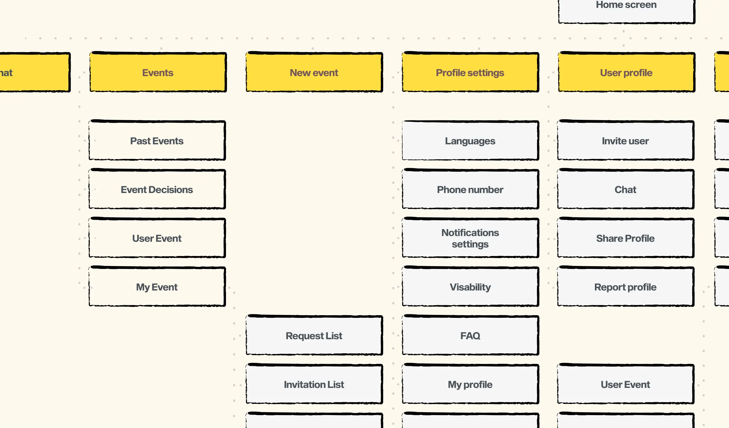
Define Information Architecture & User Flows
You’ve done the research, mapped user personas, and walked in your users’ shoes. Now it’s time to bring structure to your mobile app, to give every screen a purpose, and every tap a direction. This is where Information Architecture (IA) and User Flows take center stage.
Building Information Architecture for Mobile Apps
Information Architecture (IA) is how you arrange and structure content within your app so that everything is easy to find and logically grouped.
In mobile apps ui/ux design, IA matters even more. Small screens and distracted contexts leave no room for guesswork. If users can’t find what they need in a few taps, they’ll bounce.
What goes into strong mobile IA?
Content Inventory
- List everything your app offers: screens, features, data, media. Audit it. Prioritize it.
User Mental Models
- Use card sorting to understand how your users naturally group information. Design your structure to match how they think, not how you think.
Navigation Systems
Choose the right navigation patterns:
- Global Navigation (e.g., tab bar, side drawer) for main sections.
- Local Navigation for sub-categories and filters.
- Contextual Links inside content (e.g., "See All," “Related Items”).
Labeling Systems
- Clear, familiar terms. No jargon. No cleverness at the cost of usability.
Search & Filters
- For apps with large datasets (like e-commerce), make direct access fast and intelligent.
Once you’ve mapped out your structure, build a sitemap, a visual diagram of all major screens and how they connect. This sets the foundation for clean user flows and a more intuitive app design.
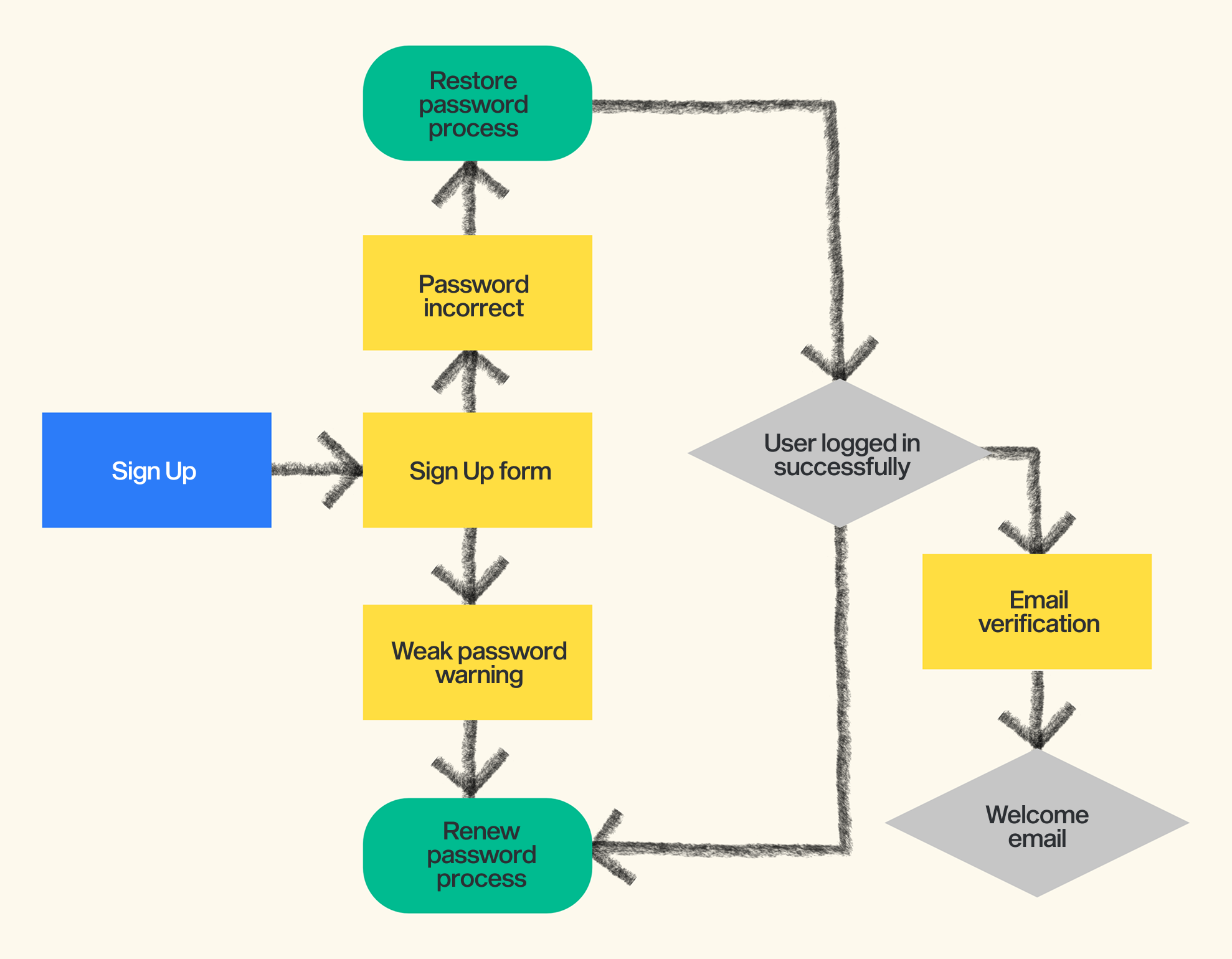
How to Create User Flows
If information architecture defines what’s inside the house, User Flows define the path someone takes to walk through it.
A user flow is a step-by-step visual of how someone completes a task: like signing up, placing an order, or booking a session. The main point here is minimizing friction, anticipating decisions, and helping users reach their goal without detours.
How to build a clear user flow:
- Start with a goal. One user. One task. E.g., “Book a doctor’s appointment.”
- Define the entry point. Where does the journey begin? App launch? Push notification? Homepage?
- Map out every screen and step.
- What does the user do here?
- What are their choices?
- What comes next?
- Include decision points. What happens if they choose “Login as Guest”? Or abandon checkout?
- Account for edge cases. Errors, timeouts, missing data, show what happens when things don’t go as planned.
- Use flowchart symbols and simple arrows to lay it out. Your goal: no dead ends, no confusion, no wasted motion.
- Review with your team. Does it make sense? Can you trim any steps? Would your primary personas navigate it easily?
🛠 Pro tip: Make your flows clickable in Figma using interactive components or links between frames. It’s a fast way to demo logic without full prototyping.
Good information architecture helps users know where they are. Good user flows help them get where they want to go. Together, they transform your app from a collection of screens into a guided, goal-oriented experience.
Wireframing Your Mobile App UX
Now it's time to move on to wireframing, an integral part of any well-structured mobile app design process. Wireframes allow teams to shape the product experience before investing in high-fidelity visuals or development work.
Wireframes are low- to mid-fidelity layouts that establish the structural logic of your app. They define content hierarchy, screen flow, and interactive elements without focusing on branding or visuals.
Effective wireframes:
- Prioritize functionality and layout over aesthetics
- Help teams align on core features and user journeys
- Make usability problems visible early on
- Reduce ambiguity in design-to-development handoff
Start with low-fidelity sketches to explore multiple options quickly. Then move to mid-fidelity wireframes, where frames, layout grids, and reusable components bring consistency and structure to your work.
When wireframing for mobile, every element counts:
- Optimize for limited screen space
- Place primary actions within thumb-reach zones
- Use platform conventions (like tab bars or gestures) thoughtfully
- Ensure CTAs, input fields, and navigation are clear and accessible
When you work in Figma, this tool can make your process collaborative and efficient. You can build standardized mobile frames, use shared libraries for recurring UI elements, and annotate flows for clarity, while keeping the focus on structure.
Once wireframes are validated, you’ll move on to UI design for mobile apps, where branding, typography, and motion bring your product to life.
UI Design Step: Look & Feel
UI design is one of the most visible and influential parts of your mobile app. This visual layer of mobile app defines how users feel an app, emotionally and functionally. A well-executed UI aligns beauty with function, turning a good product into a memorable one. Here's how to do it right.
Mobile App Branding & Visual Identity
Start by aligning the UI with your product’s brand essence:
Brand Identity
- Extend your existing visual language: colors, typography, logo, and tone to mobile app contexts.
Audience Fit
- Understand what visual cues resonate with your users. A Gen Z social app calls for vibrant gradients and motion; a B2B fintech platform benefits from restraint and clarity.
Design Moodboard
- Before designing screens, compile references to align on tone, interfaces, imagery, layouts, and UI design examples. This keeps everyone aligned and speeds design decisions.
Create a Functional and Accessible Color System
Color choices affect everything from hierarchy to emotional resonance:
Use a Limited Palette
- Establish a primary, secondary, and neutral palette. Stick to 1–2 main action colors with contrast-friendly support tones.
Design for Accessibility
- Meet WCAG contrast standards to ensure text is legible in all conditions. Use tools like Stark or Figma plugins to check.
Purposeful Color Use
- Use color to show status (green for success, red for error), guide attention, and reinforce brand.
Systematize
- Build color styles in your design tool. Define variants for states: default, hover, active, disabled.
Typography That Supports Content
Mobile typography needs to be readable and structured:
Font Choice
- Use legible sans-serif fonts with strong digital support (e.g., Inter, SF Pro, Roboto).
Establish a Typographic Scale
- Define font sizes and styles for headings, body, captions, etc. Stick to a clear hierarchy.
Optimize for Mobile
- Minimum body text size is 14–16px. Keep line length short and spacing generous for readability.
Reusable Text Styles
- Create and use styles for each text role to ensure consistency and simplify updates.
Iconography: Clarity over Decoration
Icons help reduce cognitive load and speed up navigation.
Keep Style Consistent
- Stick with one icon set or visual style: outline, filled, or glyph.
Test Recognition
- Use familiar symbols. Pair with labels when meaning isn’t obvious.
Touch Area
- Ensure icons meet tap target minimums, 44x44px for iOS, 48dp for Android.
Layout and Responsive Spacing
Structure is what makes your UI scannable and predictable.
Use Grid Systems
- A base 8pt or 4pt grid brings alignment and harmony.
Whitespace is Essential
- It guides focus and prevents overload.
Visual Hierarchy
- Use size, position, and color contrast to indicate importance.
Responsiveness
- Mobile design must adapt, plan for screen sizes, orientations, and device types.
Reusable Components and Design Systems
To stay consistent and efficient:
Build a UI Kit in your design tool
- Define core elements: buttons, inputs, nav bars, tabs.
Use Components and Variants
- Design reusable assets with states (default, hover, pressed, disabled).
Document Usage
- Clarify when and how components should be used.
Great UI design doesn’t happen by chance. It’s the outcome of systematic thinking: from a structured layout to a consistent visual language. When color, typography, spacing, and iconography are designed to work together, you’ll reduce churn, avoid confusion, and speed up future iterations. The more structure you create now, the more flexibility you gain later.
Build a Clickable App Prototype
Once wireframes and UI design are in place, prototyping transforms static screens into interactive experiences. It bridges the gap between design thinking and real-world behavior, simulating how users navigate your mobile app and exposing friction early in the process.
Unlike wireframes, which focus on layout and logic, a prototype brings the product to life. You can model every interaction, from tapping a CTA to opening a side menu or completing a purchase, and validate how the interface feels before anything is coded.
For example, in Figma prototyping is built into the design layer, allowing you to:
- Link screens with defined triggers (e.g., tap, drag, delay)
- Create transitions that mirror native user behavior (e.g., slide, overlay, smart animate)
- Test scrollable content, overlays, modals, and input flows
- Share the prototype with anyone for review, even without a Figma account
The value lies in speed and precision. You can walk through realistic user journeys and identify blockers long before mobile app development starts. It also serves as a reliable reference for developers, clarifying how the user interface should behave under different scenarios.
Instead of guessing what users might do, prototyping lets you observe their interaction patterns in real time, and iterate confidently.
Add Motion & Microinteractions
Motion and microinteractions play a key role in mobile UX optimization. When thoughtfully applied, motion and microinteractions turn static screens into responsive, intuitive experiences that feel alive and emotionally engaging. Done well, they communicate intent and guide behavior.
At their core, motion refers to how interface elements move and transition, such as sliding between screens or expanding menus.
Microinteractions are the tiny, purposeful moments tied to a single action, like tapping a button, submitting a form, or refreshing a feed. These subtle animations play an important role in reinforcing outcomes, highlighting status changes, and improving the overall user experience.
Animations that enhance usability
Well-executed animations provide visual continuity and help users build mental models of how your app works. For instance, sliding in a new screen from the right reinforces the feeling of moving forward, while a bottom sheet suggests a temporary overlay. These patterns make your interface feel natural.
More importantly, motion gives immediate feedback. Users want to know when their action has been registered, whether it's liking a post or adding an item to a cart.
Motion supports better UX and solves real usability problems:
- Making Actions Obvious: Subtle animations can suggest how users should interact with elements. A tooltip that slides in, or a pulsing arrow, indicates there’s more to discover.
- Spatial Orientation: Transitions between screens or components give users a sense of “where they are” within the mobile app.
- Progress Communication: Animations make system status, like loading or error states.
- Change Awareness: Rather than instantly swapping content, animated transitions guide the user’s attention to what changed and why.
- Delight and Personality: Polished microinteractions, such as celebrating a goal or completing a task, make the experience memorable and reinforce brand identity.
Examples of Microinteractions in Mobile Apps
You encounter them everywhere:
- A heart icon animating when a post is liked.
- A switch toggling with a smooth transition.
- A form field shaking when input is invalid.
- Pulling to refresh a list and seeing a spinner.
- A cart icon subtly pulsing when a new item is added.
Each of these enhances the sense of responsiveness and provides clarity about what’s happening, often eliminating the need for extra text or instruction.
Design Principles for Mobile Animation
Animations should feel light, fast, and purposeful. On mobile especially, performance and clarity matter more than visual flourish.
A few core principles:
- Every animation must have a reason. Ask: Does it guide? Provide feedback? Show hierarchy? Indicate status?
- Keep animations short (typically 200–500ms). Avoid unnecessary complexity, and ensure they reinforce, not distract from, the task.
- Lightweight. Overly elaborate motion slows down UX and tires users quickly.
- Responsiveness. Animations must respond instantly to touch and should never cause delay or jankiness.
- Consistency builds trust. Reuse motion patterns across your product to create a predictable experience in mobile app UX design.
Users now expect polished, responsive experiences. If your mobile app feels static or unresponsive, even demanded functionality may go unnoticed. In competitive markets, these seemingly small details can be the difference between churn and retention.
Usability Testing & Iteration
Beautiful UI is worthless if users get stuck trying to complete simple tasks. Beautiful UI doesn’t guarantee success, usability does.
That’s why testing with real users is a critical practice. It reveals how well your mobile app design holds up in the wild. Iteration is what follows: the ongoing process of refining your product based on what real people actually do, not what we assume they’ll do.
Usability testing means observing real users try to accomplish real tasks inside your app, attempting actual goals like registering, purchasing, or navigating. You’re watching for hesitation, confusion, workarounds, or silent frustration.
To run usability testing effectively:
- Start with clear goals: Can users finish onboarding without help? Can they find and complete checkout?
- Recruit users that match your audience.
- Give realistic tasks, not instructions. Let users explore. For example: "Find a yoga class and book a session."
You can test in person or remotely, moderated or unmoderated, but always record what happens. Collect screen recordings, take notes on behaviors, and ask clarifying questions: “What did you expect would happen when you tapped that?”
After the test:
- Identify recurring patterns: where users drop off, hesitate, or misinterpret.
- Prioritize issues by frequency and severity. Not every problem is equally urgent, focus on the ones that block core user goals.
What comes next is iteration. You make changes, small or structural, based on those insights. Then you test again. This feedback loop continues until your app it’s intuitive, reliable, and aligned with user expectations.
Why it matters:
- You discover issues you never expected.
- You validate if your design choices really work.
- You avoid costly mistakes post-development.
- You build products that users actually enjoy using.
Behind every tap is a person trying to get something done. Usability testing for mobile applications reminds us that design is about helping people. The more you observe, test, and iterate, the more intuitive and empowering your app becomes.
What Happens After Launch? The Work Doesn’t Stop
The moment your app hits the store, the real work begins.
Now real users are tapping, swiping, dropping off or converting. This is where you learn what truly works. And what doesn’t.
In our
Mobile App Optimization Guide After Launch, we show how to track what matters, spot friction, run A/B tests, and keep your product improving. Because post-launch optimization, it’s a critical part of the mobile app success.
Real-World Example: UI/UX Design Case Study for a Mobile App
One of the most effective ways to understand the real impact of a structured UI/UX design process for mobile apps is through real-world examples. At our software development company, startups come to us with just an idea, no team, no tech background, just a clear vision.
The following case is a great example of how we helped bring a client’s vision to life and turn it into a thoughtful app.
Our client was building a mobile social app that blends elements of dating and event discovery. It allows users to find companions for concerts, exhibitions, parties, or simply to connect over common interests.
Unlike traditional swipe-based dating apps, client’s social app centers around real-life interaction, encouraging users to build connections through experiences, not just profiles.
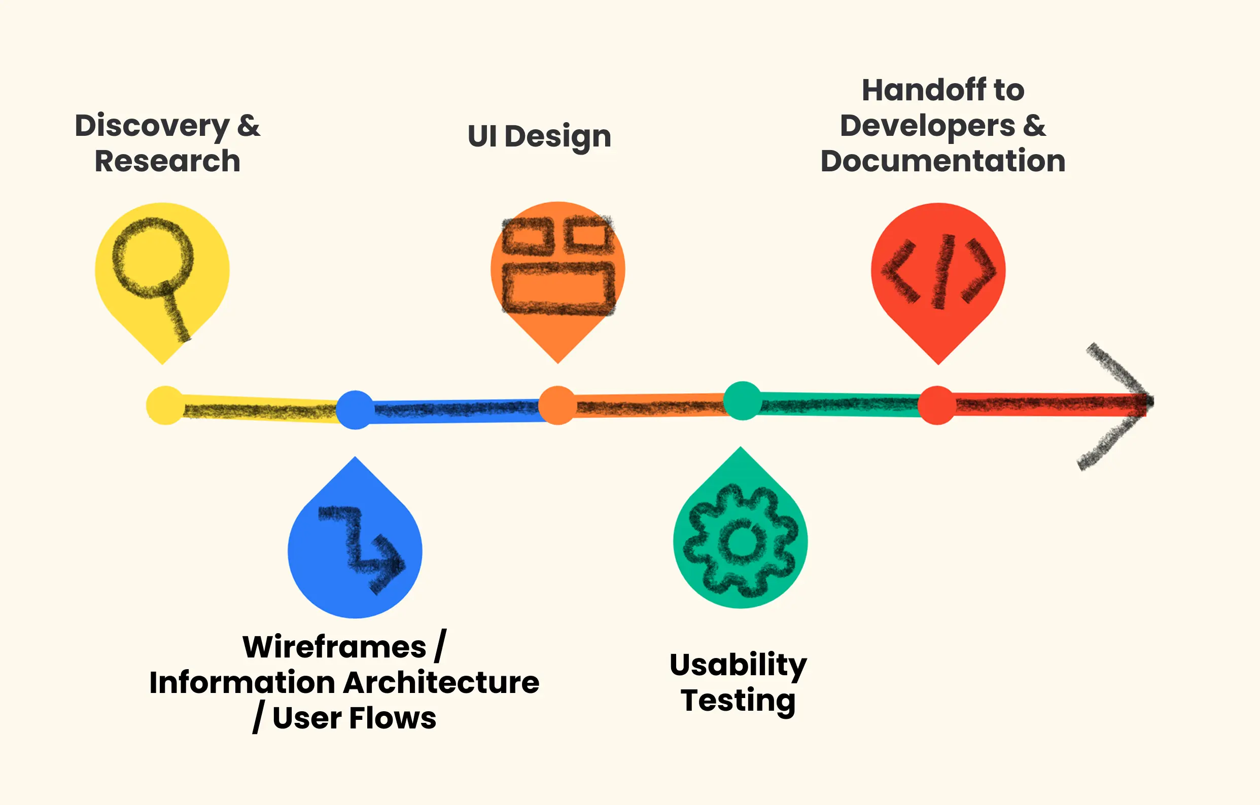
Our Mobile App Design Process in Action
We applied our full UI/UX design process, starting with research and ending with a developer-ready design system:
Discovery & Research
- We conducted market and competitor analysis, interviewed target users, and identified what sets this mobile app apart. Our research helped define core flows like onboarding, event discovery, and interaction initiation.
Personas, User Journeys, and Flow Mapping
- We created user personas and mapped out key scenarios like onboarding, event discovery, using user journey mapping and flow diagrams that aligned with real motivations and behaviors.
Wireframes and Prototyping
- We created black-and-white wireframes to shape flows, then built interactive prototypes to test onboarding and engagement mechanics.
UI Design & Brand Identity
- The visual direction focused on warmth, approachability, and simplicity. We designed a custom mobile UI kit with scalable components, iconography, and animation principles.
We helped the founder go from concept to a design-ready MVP through thoughtful, user-centered design:
- Interactive Prototypes: Used in early-stage user testing
- Mobile-Optimized Event Feed: Personalized by user interest and activity
- Сlear Onboarding Flow: Designed to reduce friction and build trust
- Animation & Motion: To enhance user delight and interaction clarity
The project emerged with a fully designed MVP. The founder was able to move forward with confidence, reduce risks, validate the concept early, and confidently prepare the product for launch. See a visual breakdown of the process and outcomes.
Conclusion: Your Clear UI/UX Design Path to a Better Mobile App
If you’ve made it this far, you already know that designing a mobile app isn’t about filling screens with buttons and colors. It’s about shaping an experience. And for startups, every design decision is tied to risk, speed, and limited resources.
Designing a mobile app from scratch can feel overwhelming, but it doesn’t have to be. This guide walked you through the full UI/UX design process for mobile apps, step by step.
We covered the full design journey:
- From setting product goals and doing research,
- To mapping user journeys and creating wireframes,
- To designing thoughtful interfaces, building prototypes, testing with real users, and preparing for development and scale.
At Kernelics, we partner with early-stage teams to turn ideas into real, scalable mobile products. Our design team works side by side with you, from first wireframe to launch-ready UI, combining design best practices with technical reality.
Our UI/UX design services for startups are built around speed, clarity, and product-market fit, helping founders test their vision and launch with confidence.
Whether you need help building user flows, preparing developer-ready design systems, or
creating a polished MVP, our mobile app design services are made to fit startup needs.
With the right design process and the right tech partner, you can move faster, launch stronger, and build a product that not only works, but wins.
Let’s build something your users won’t want to put down.